Sunday, June 12, 2011

Malaysia: Time Travel to the Past

It's never been a place in my mind that I would want to visit, but yes, it's part of my course requirement and we visit the National Museum. Apart from feeling resistant when I first heard about it, I never thought I would actually like that place.

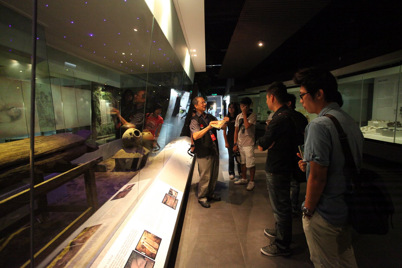
The building itself was an iconic building in Malaysia. They have 4 different galleries in there, it is a historical museum, thus all those 4 galleries consist of different era on the forming of Malaysia till today.

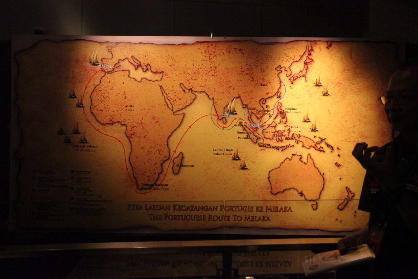
I'm very interested in the growth of human intellect. How we create and it ended with destructions, more to the patterns of human behavior. Anyway, that's out of the point. Just look at this image:


Fort built by the Portuguese when they conquered Malacca. How this stronghold falls and leaving just the east gate called "Porta De Santiago". Recently they have just uncovered another part of the wall near the river, while the building of "Taming Sari Tower". I wanted to measure how large was this in the actual scale of the map of Malacca today.

Pictures of the tour:


Friday, February 4, 2011

Digital Photography - Class Assignment (Studio Portrait)

Fellow friends, this picture is one of my in class assignment and I need comments on the characteristic that this model portray. (For instance: Fierce, Cruel, Angry, Mafia...etc) Thank you very much for the comments.

Sunday, January 23, 2011

Digital Photography - Assignment 1(Scanography)

 "Brave enough to stand up and walk"
"Different"

Tuesday, January 18, 2011

Web Design 2 - Final Project Progress 2(Strategic Brief)


1.0 Strategic Brief

Papparich identity and colour mood is heading towards a more classy feel and yet keeping its essence of traditional and cultural value, this is the differ point comparing to its competitor which keeping its typical kopitiam elements. Hence, what I’m trying to provide here with the new look for Papparich website is warm colour mood, space, and different class of kopitiam.

            1.1 Project Definition
To restructure information on the existing webpage so that it is more welcoming to read and attractive to readers.
Outstand webpage among all competitors.
To respond to customers needs and to increase popularity of Papparich.

1.2 Current Site’s Analysis Goals
The current site is having major problems with the menu options are at the bottom of the page. Every time user has to navigate and scroll to the bottom of the page just to click on the buttons to go to the desired page. Users would get annoyed after a while.
Apart from that, text just displayed in long row of words and information just being throw out in one long breath, not allowing users to choose what they want to read.
Menu options restructuring.
These are the few things which firstly needed to improve.

1.3 Client’s Analysis

                1.3.1 Background Information
PappaRich is not like any other kopitiam. We truly beg to differ. The run-of-the-mill kopitiam simply serve coffee and asian delicacies at affordable prices, merely to attract customers. Affordable pricing of the drinks and food served is not going to keep the customers coming back. We, at PappaRich, focus our attention on the QUALITY of our foods and drinks. We are proud of how authentic your favorite foods are. You enjoying your orders at Pappa, while spending quality time with friends and families is the epitome of our goal. We envision each and every of your visit to PappaRich is one that’s better than your driving of 300km to eat at your hometown.
This is even enhanced further by our team’s friendly smiles and our authentic restaurant ambience. We do our best to fulfill every need of the patron. Having great ambience and realistically decorated surroundings will make our customers’ trip to Pappa Kopitiam even more unforgettable. They can now enjoy good food and beverages at a soothing and everlasting environment.

                                1.3.2 Mission and Vision Statement
Papparich to provide authentic Asian way to spend time with friends, and families, while enjoying their timeless classic delicacies.

1.4 Short and Long Term Site Goals
To create a well structured and functional webpage which is more user friendly to the readers, at the same time creating a more efficient way of delivering our message to the customers.
To implement the idea on the customers impression that Papparich is a higher class kopitiam among all the other competitors.
To increase business sales by having promotions and advertising on Papparich Specialties.

1.5 Target Audience
Young working adults which are more exposed to internet that work in the city.

1.6 Competitors Analysis
Most of the competitors are just using very common templates for their webpage, if we are able to produce more space to the Papparich webpage, it would distinguish the difference of identity of Papparich comparing to the others.

Web Design 2 - Final Project Progress 2(WireFrame)

Web Design 2 - Final Project Progress 2(Moodboard)

Web Design 2 - Final Project Progress 1(SiteMap V2)

Sunday, January 9, 2011

Web Design 2 - Final Project Progress 1(Competitors Website)

Old Town White Coffee


Analysis: Old Town White Coffee Website is definitely much more organised and developed compared to out clients. Furthermore, its in flash, allowing the audience to have more interactivity with the site itself. Menu List made more sense than Papparich. Not leaving overflowing text, allowing the audience to read or see what they want to read and see.

Pak Li Kopitiam
Analysis: The color mood is not too heavy compared to Old Town White Coffee. Very organised, welldone menu page.

Hailam Kopitiam

Analysis: Better gridlines system, however, felt its just a very usual and common template by web design agencies.

Pak Hailam Kopitiam

Analysis: Nice layout and design, typography treatment can be better. I'm unsure of the relevance of the movie trailer button included as one of the menu list.

Web Design 2 - Final Project Progress 1(SiteMap)

I've proposed a more simplified menu structure as many of the information can be categories under the same title.

Web Design 2 - Final Project Progress 1(Exisiting WedPage Analysis)

On first impression, the exisiting webpage for PappaRich is very basic for the display of information. It's lacking of many design elements, typography treatment, colour choice and information structure as well as user interactivity.

Homepage


1. Losing it's professionalism on the look of the first page.
2. Logo's out of place depending on different computer.
3. Text too long, not inviting to read.
4. Menu bar should be obvious on top.

Menu Page


1. Messy arrangement of food list.
2. Typegraphy can be improved.
3. User had to scroll down to the end to find the option for the Webpage Menu to navigate to the other page.
4. Type hierarchy.

Awards Page


1. Bad choice of typeface.
2. Text allignment.
3. No visual graphic enhancement to the content.

Outlets Page


1. Inconsistency of graphic material for different pages.
2. Bad choice of typeface.
3. Good consideration of including map for all outlets, can enhance graphical buttons.
4 Lack of Typography considerations.

Franchising Page


1. Inconsistency of graphic material used.
2. Lack of Typography considerations.

Gallery Page


1. Messy page layout.

Events Page


1. All large photo being loaded at the same time, will cause long downloading time for slower broadband user.
2. Photos display layout can be much better.
3. Consistency of caption layout.

About Us Page


1. Text too long, typography consideration.